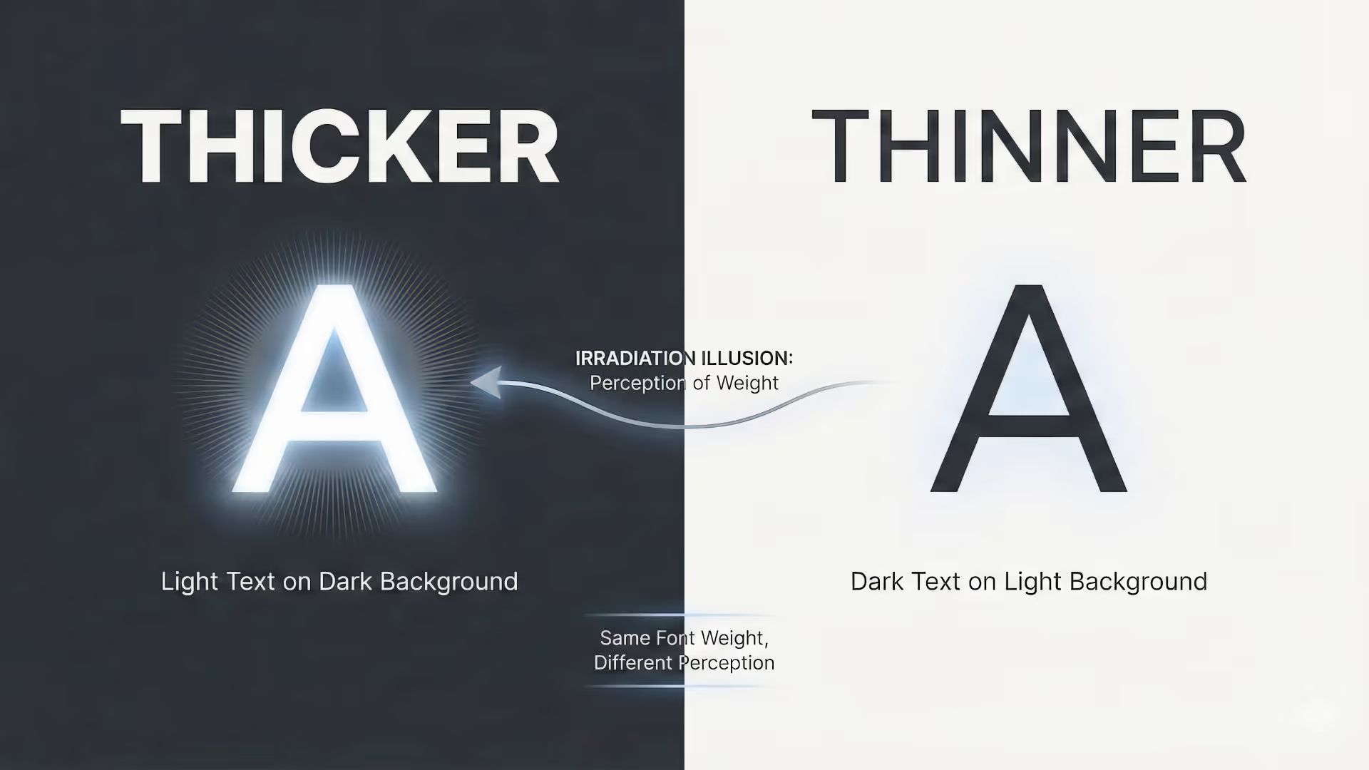
Adam Argyle shows how dark mode makes white text look heavier than black text, and how variable fonts with the GRAD axis can rebalance weight without layout shift. He also smooths bold link hovers and adapts grade to prefers-contrast, so text stays readable across themes.
nerdy.dev/adjust-perceived-typepace-weight-for-dark-mode-without-layout-shift
