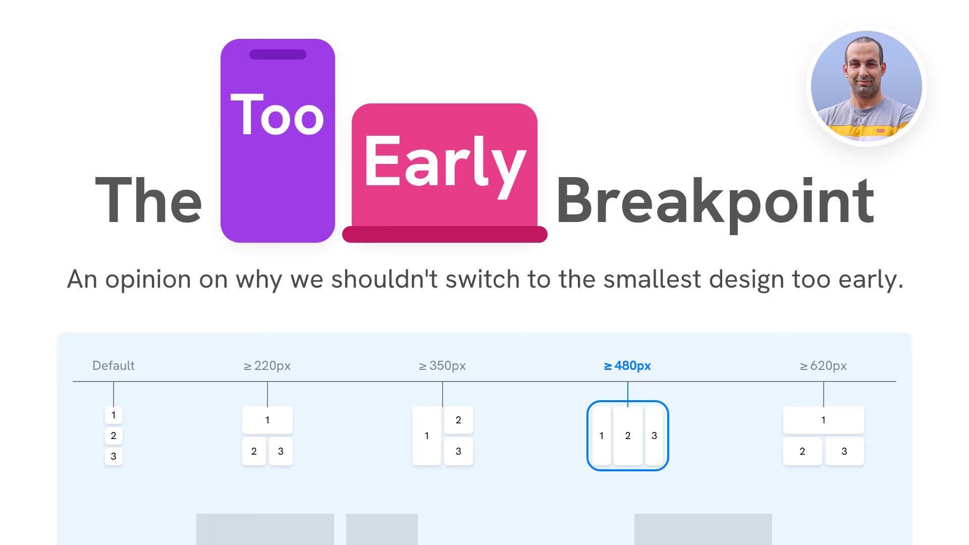
Ahmad Shadeed explains why many websites switch to a mobile layout too soon. With examples from Time and TechCrunch, he shows how designs break in split-screen, tablet, and iOS link previews. The fix: intermediate breakpoints, container queries, and flexible CSS Grid and Flexbox layouts that adapt to available space instead of relying on rigid viewport widths.
The too early breakpoint