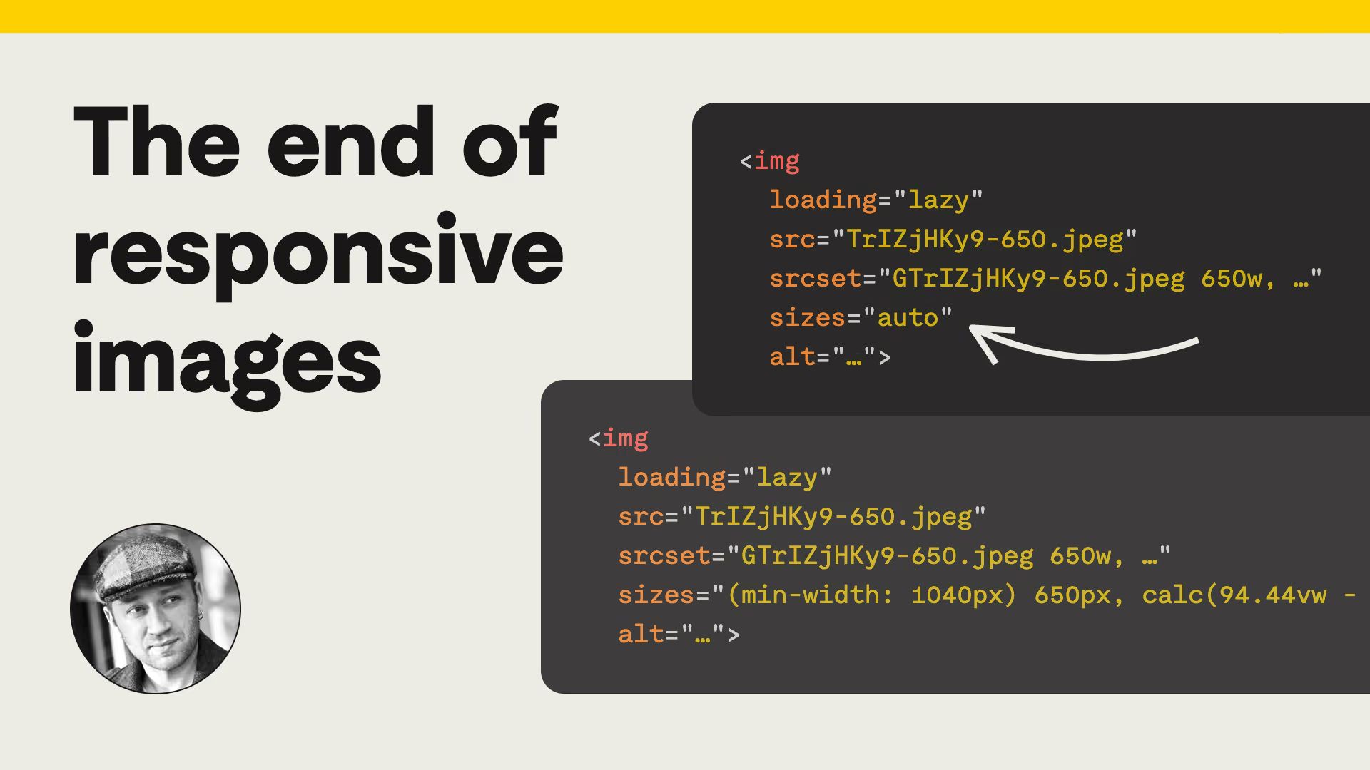
Mat Marquis, former chair of the Responsive Image Community Group, looks back on a decade of wrestling with the sizes attribute and explains how sizes="auto" with loading="lazy" finally hands that work back to the browser for most images. Now supported across Firefox, Safari, and Chrome, descriptive sizes values can be reserved only for above-the-fold images.
The end of responsive images