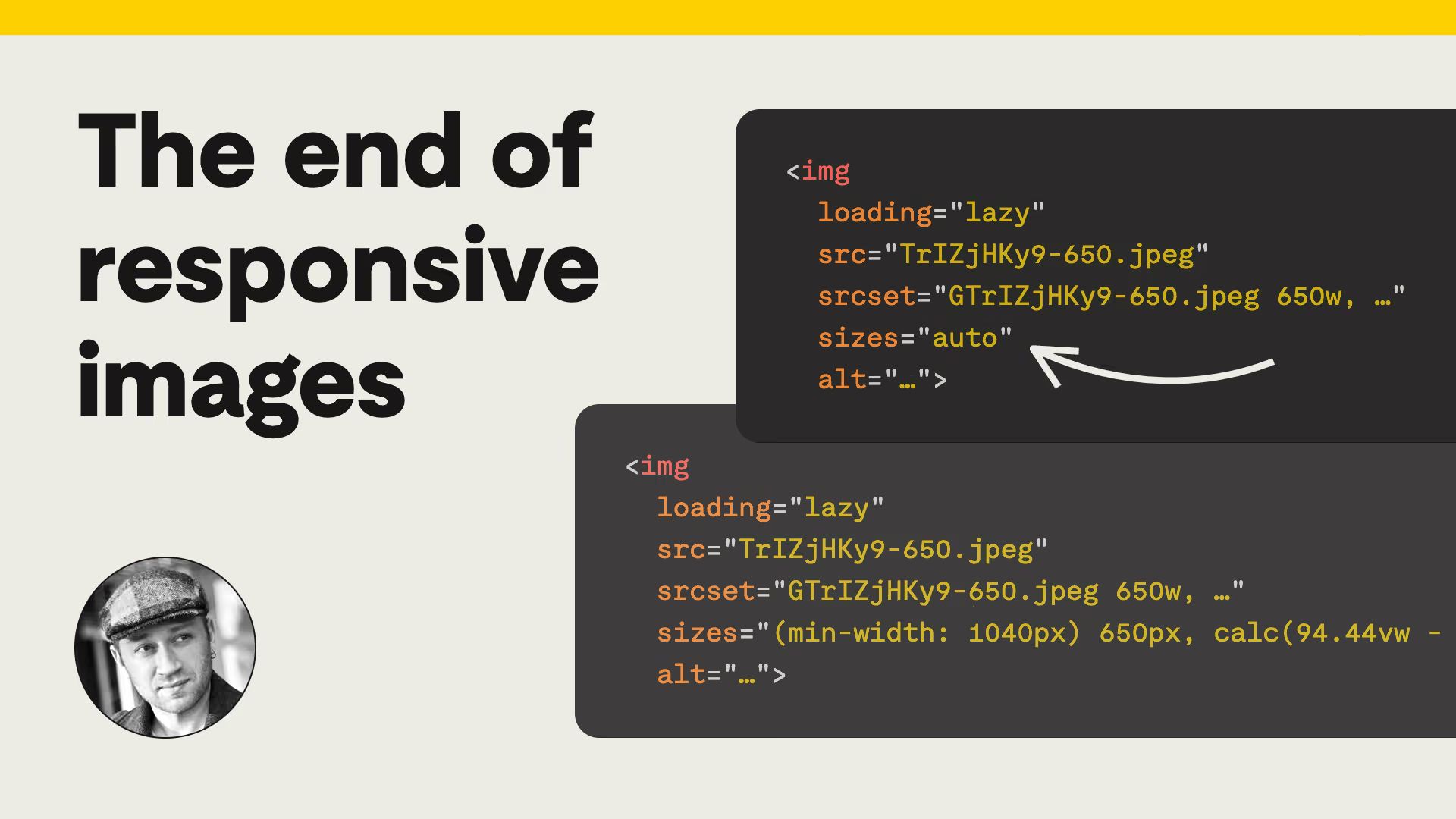
The end of responsive images
How sizes="auto" with loading="lazy" lets browsers handle most responsive images.
Web Standards
Daily web platform news
How sizes="auto" with loading="lazy" lets browsers handle most responsive images.
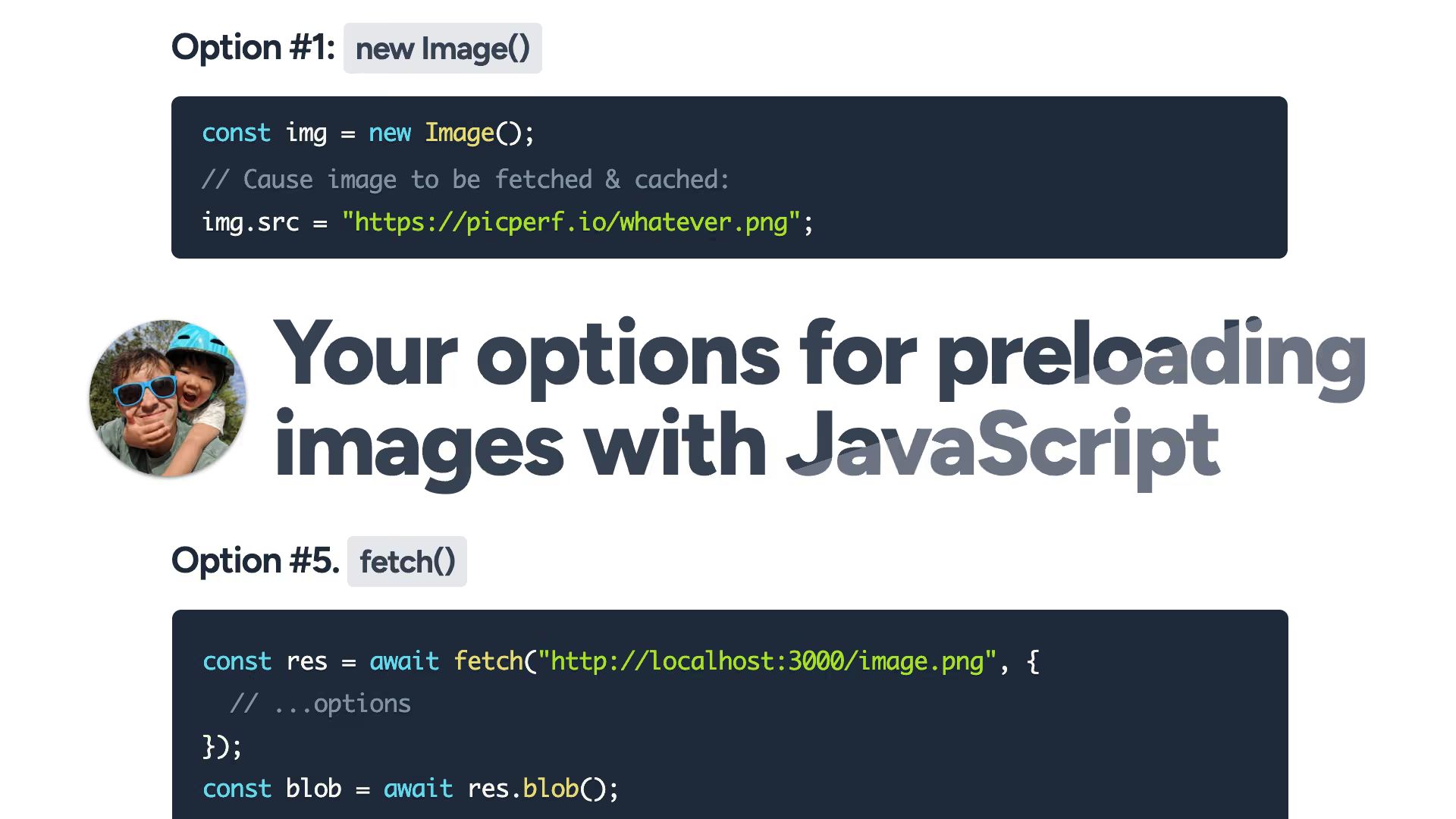
Five approaches compared with their caching and CORS trade-offs.
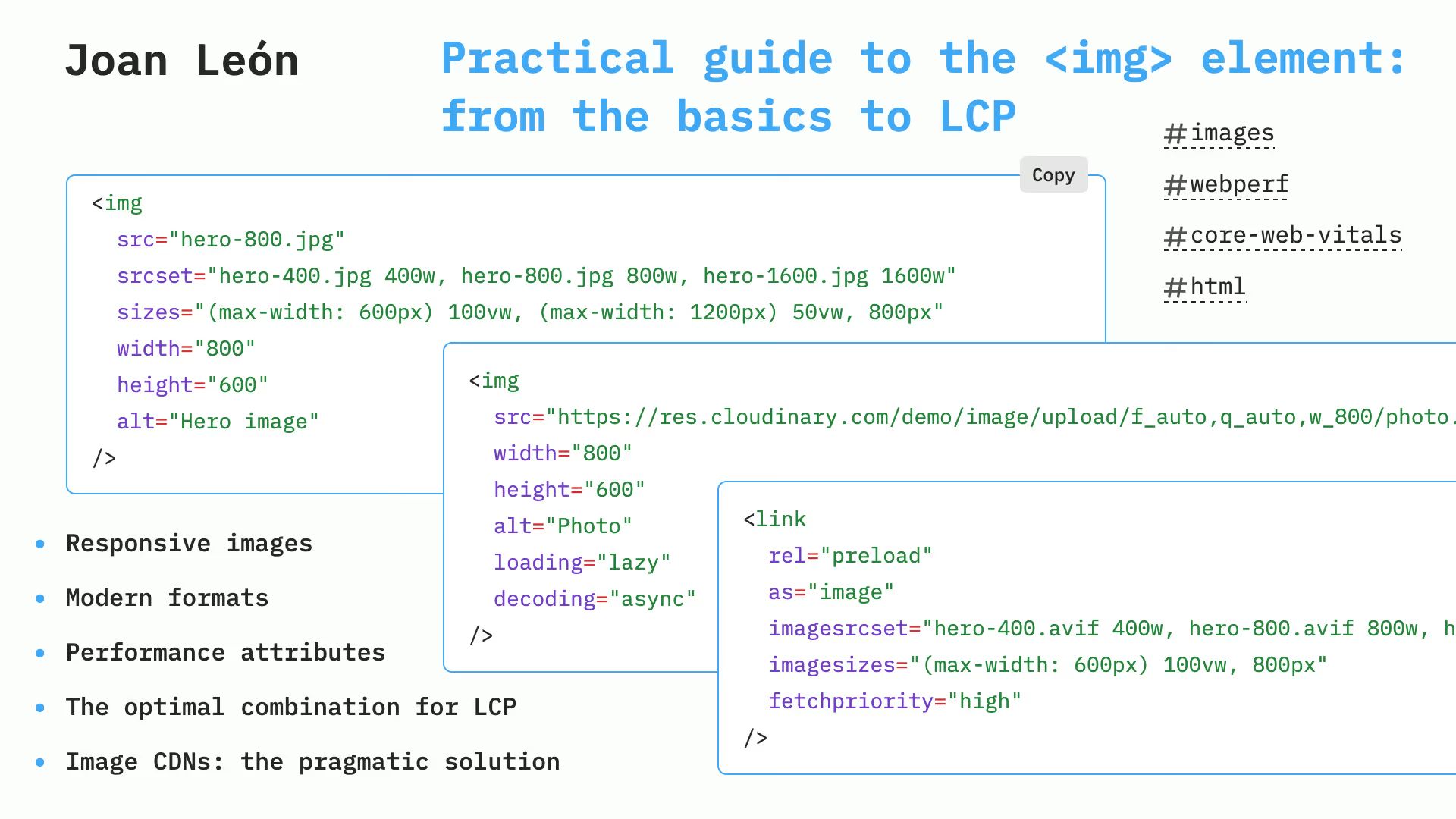
<img> element: from basics to LCPImage markup tweaks that boost Core Web Vitals.

A practical guide to CSS spritesheets, steps(), and real-world trade-offs.

How to pad portrait and landscape images with blurred edges using modern CSS.