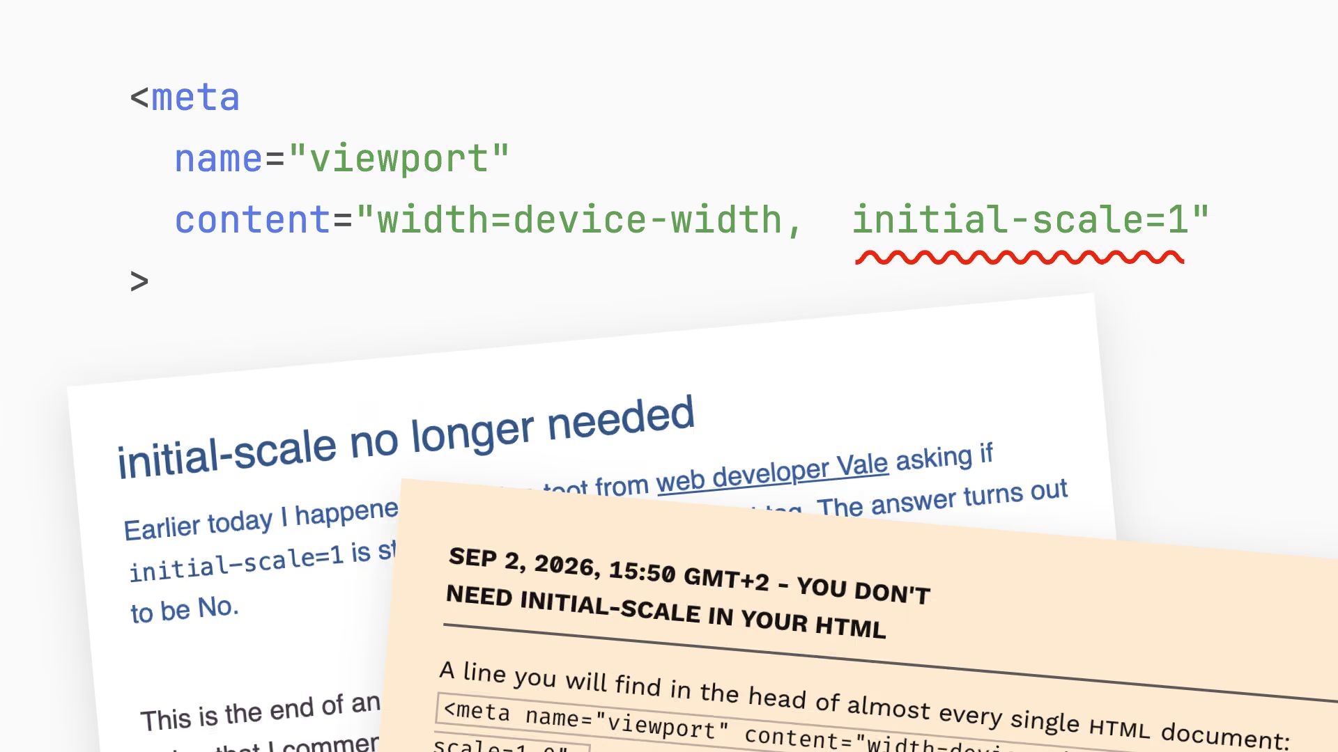
Declan Chidlow and Peter-Paul Koch published the same finding hours apart: the viewport <meta name="viewport"> only needs width=device-width. The initial-scale=1 part was there to fix zooming in old iOS versions, and Safari now recalculates the layout viewport on orientation change without it. Nineteen bytes saved in every document head.
You don’t need initial-scale in your HTML