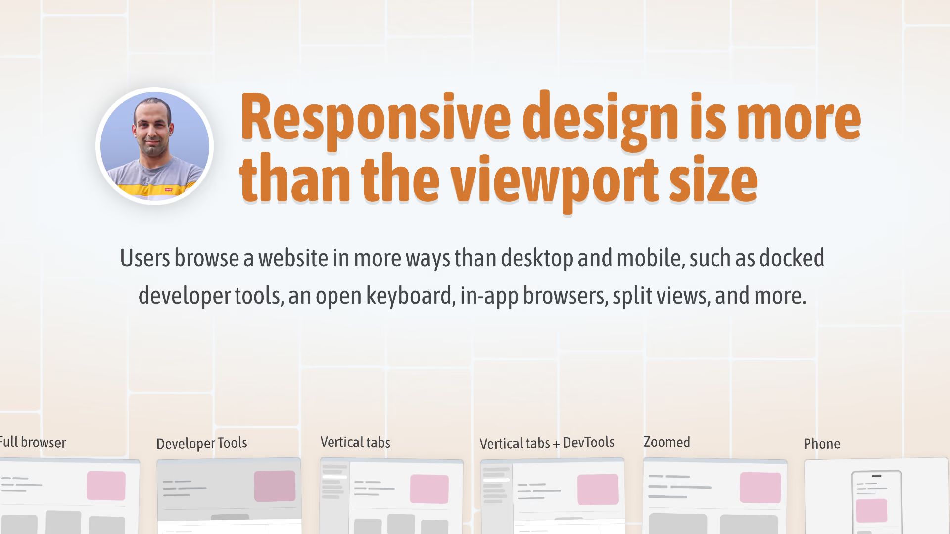
Ahmad Shadeed built a tool that shows how a design behaves in contexts that force unusual viewport sizes, beyond just mobile and desktop. Modes include a full browser, open DevTools, vertical tabs, vertical tabs with DevTools, a zoomed-in page, a landscape phone, and print styles. Useful for designers, product managers, and developers to catch layouts that break where real users browse.
Beyond the viewport: introducing Site Seeing