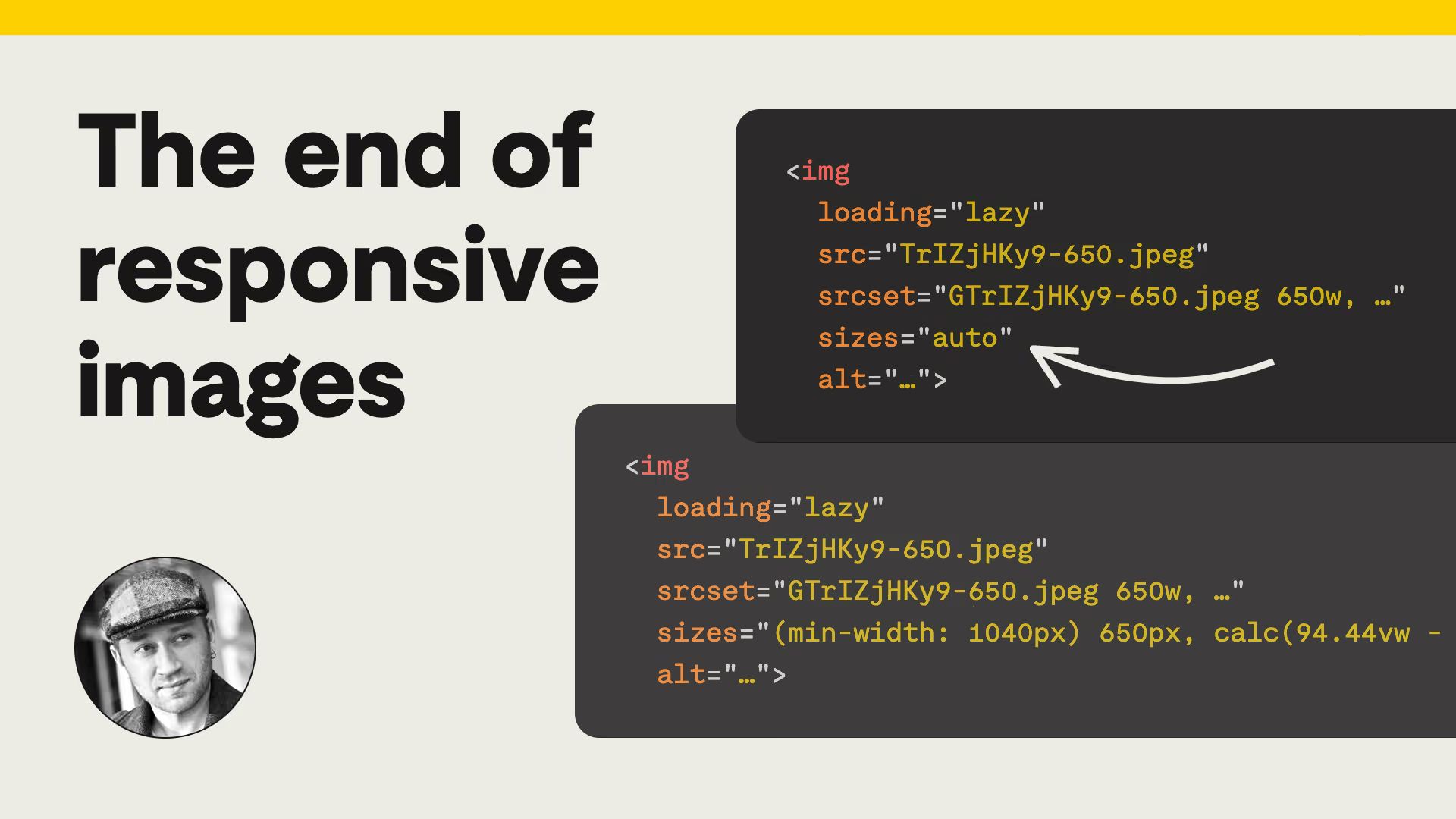
The end of responsive images
How sizes="auto" with loading="lazy" lets browsers handle most responsive images.

Web Standards
Daily web platform news
How sizes="auto" with loading="lazy" lets browsers handle most responsive images.
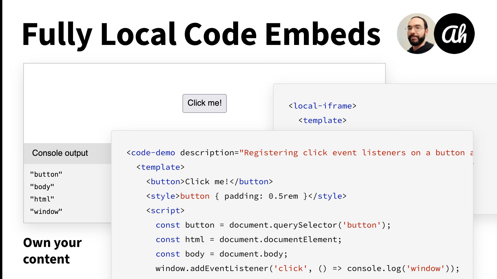
A web component for isolated code sandboxes without third-party embeds.
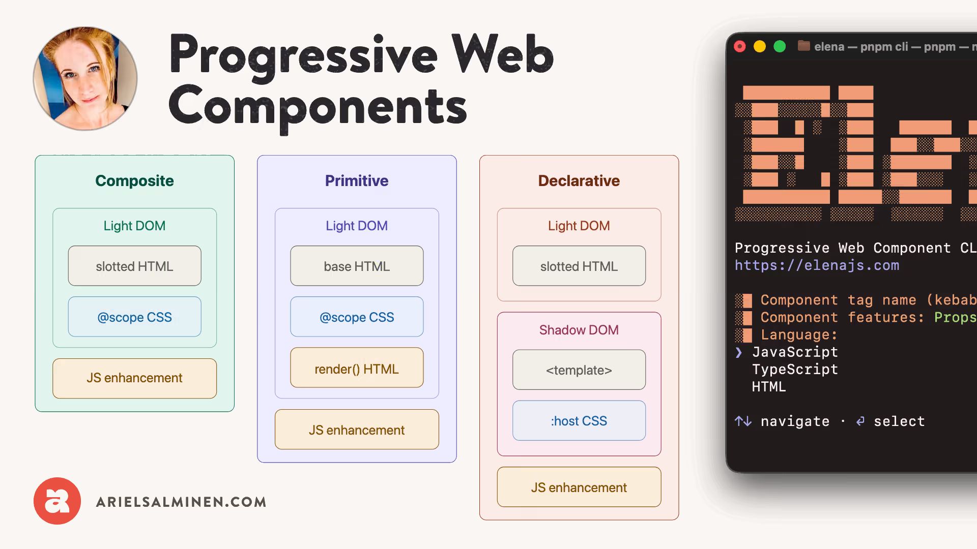
An HTML-and-CSS-first library for building web components that hydrate with JS.

Practical advice on OG tags, sharing images, titles, blurbs, and canonical URLs.
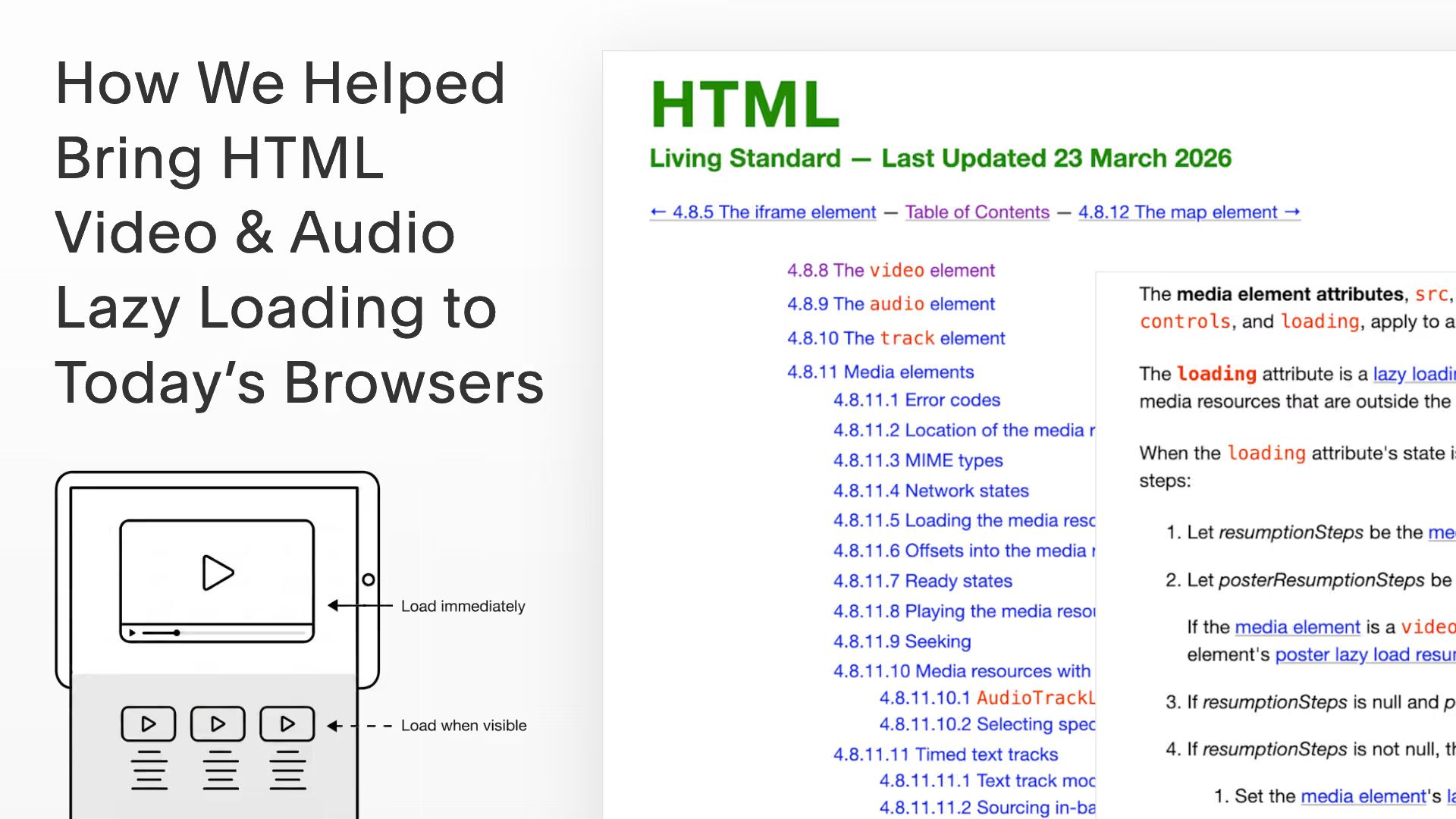
How Squarespace engineers contributed lazy loading for video and audio to the web platform.

Retrofitting AgnosticUI with ElementInternals and form validation.
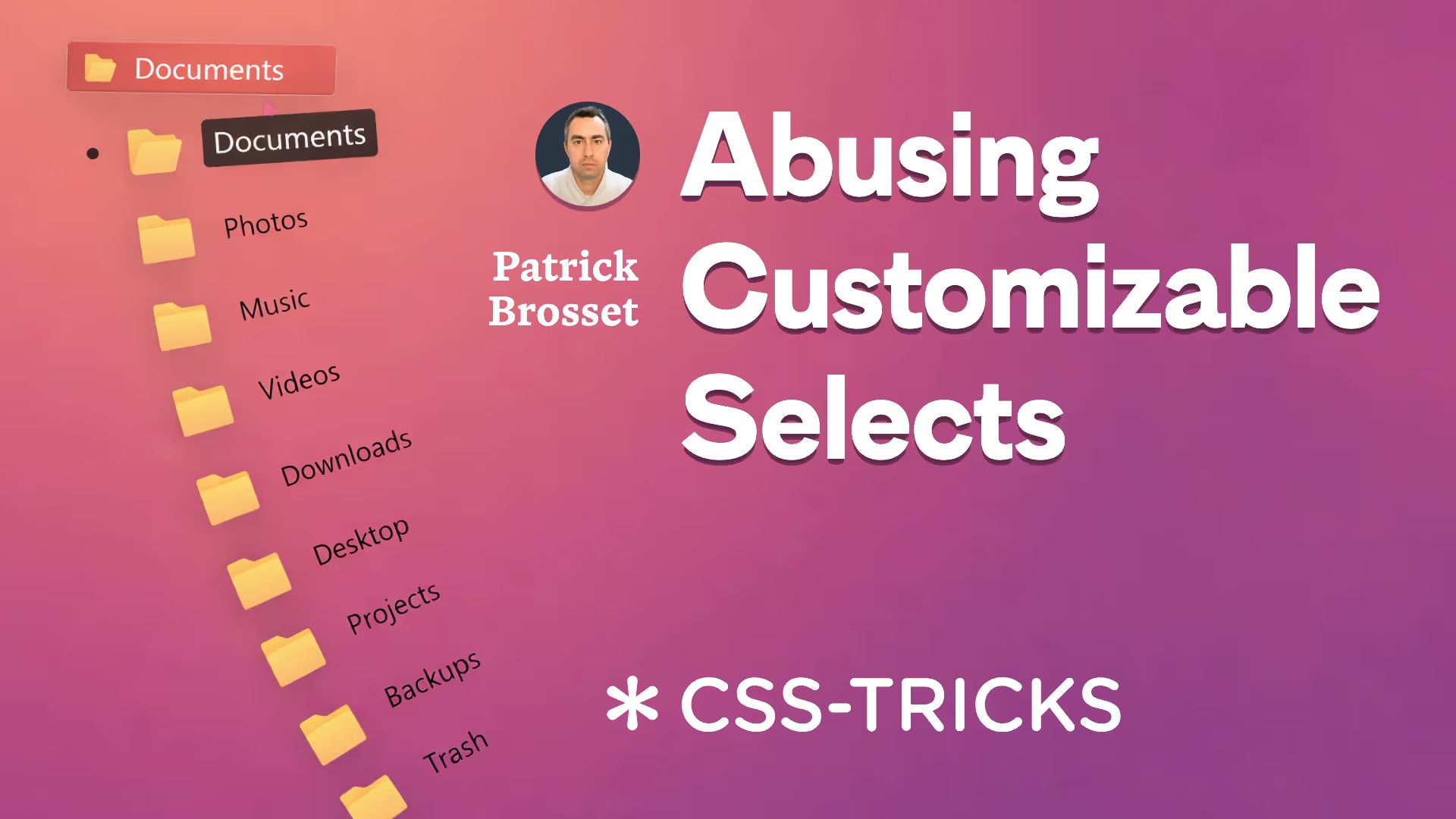
Three creative CSS demos with folders, cards, and emojis.
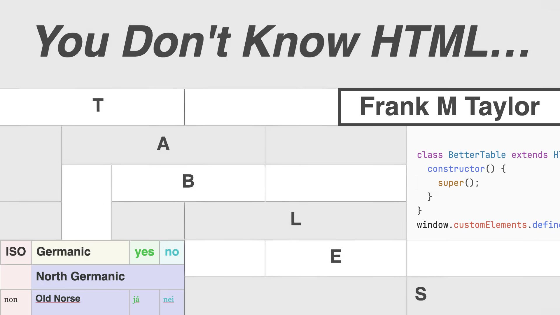
Advanced deep-dive into table vocabulary, semantics, and the Table Object Model.

How the proposed textscale meta tag honors OS text size settings on mobile.
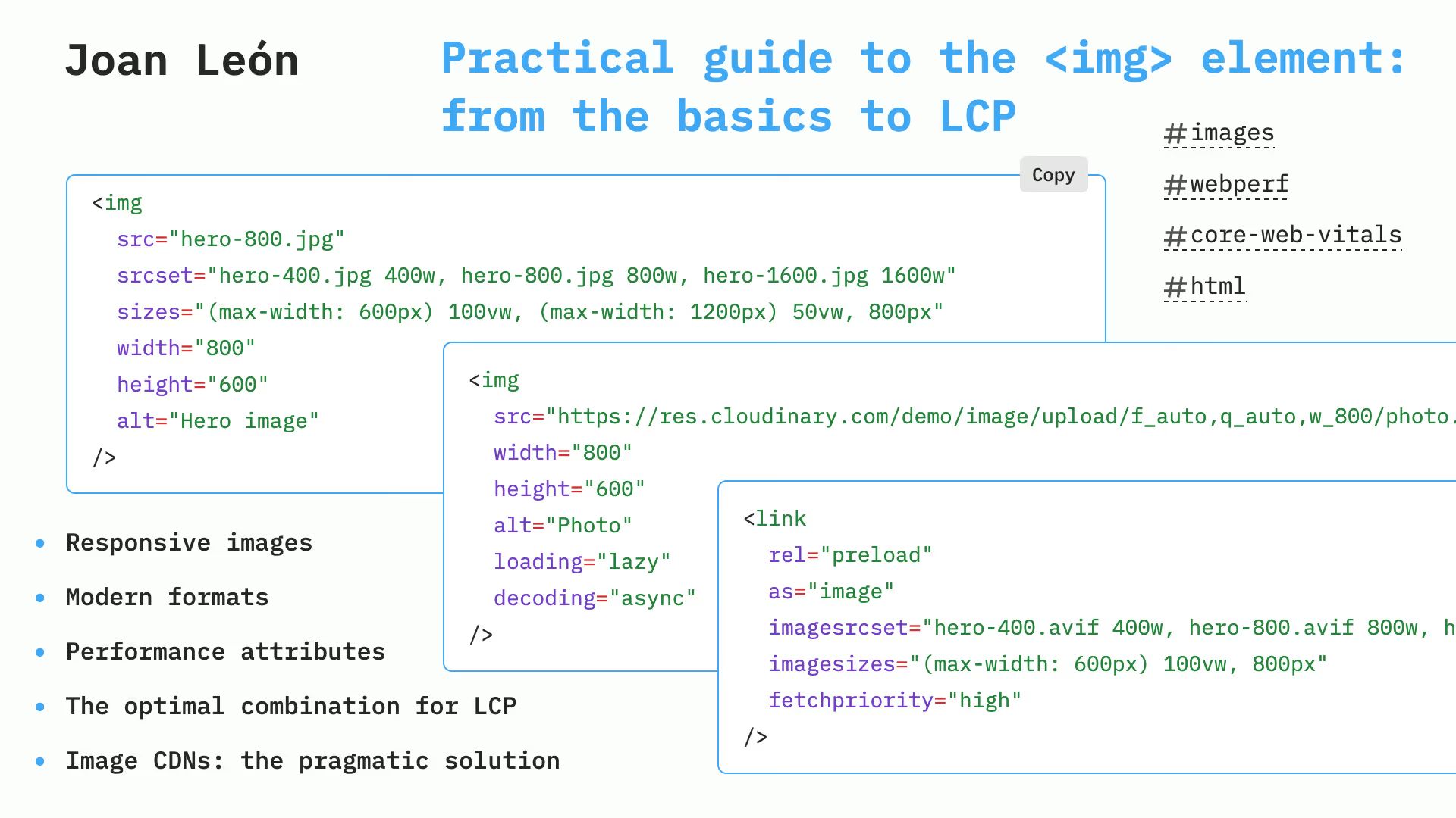
<img> element: from basics to LCPImage markup tweaks that boost Core Web Vitals.

Short videos on headings, images, links, buttons, and forms, with practical accessibility tips.

Hamburger menu built with <dialog>, minimal JS fallback, and smooth transitions.